Together with a talented web designer I’ve created a concept to update OpenStreetMap’s front page which you can see live over here:
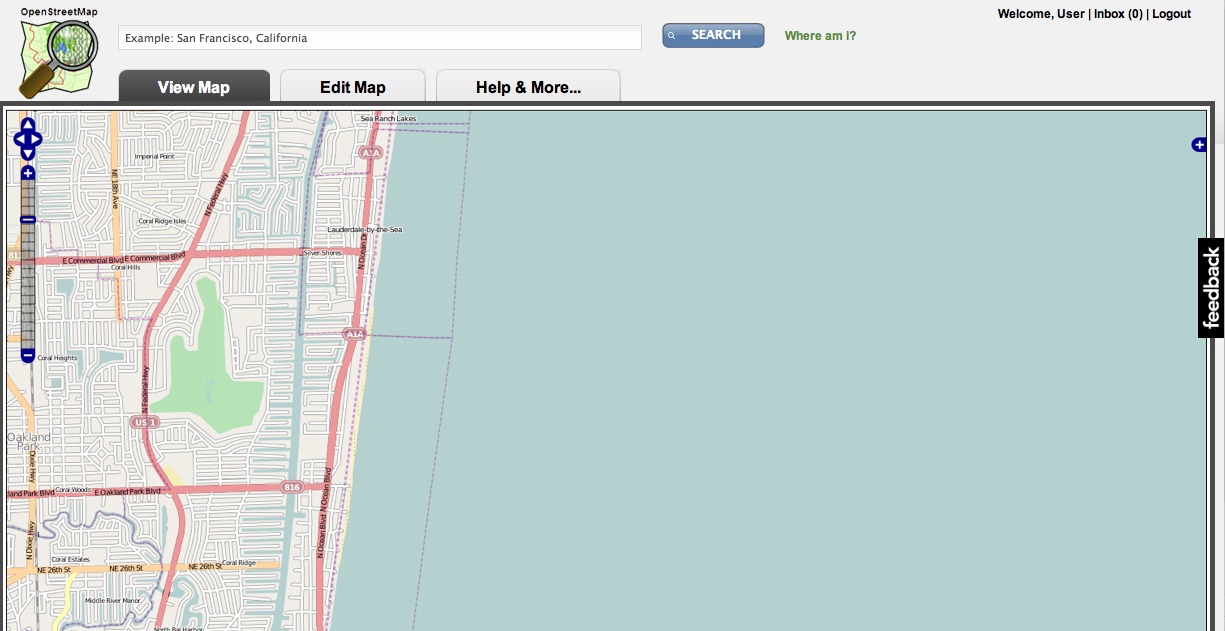
The basic theme should be familiar. There is view/edit tab to view and manipulate the map (which have dummy images in them) along with login and user info, a search box and so on. It’s cleaned up a little from the existing page. I will highlight the main innovations.
First, a “Help & More…” tab:
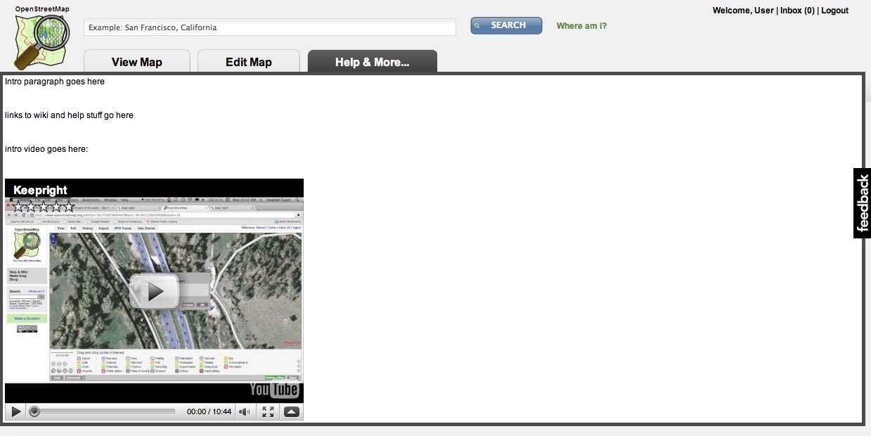
Although in rough mockup form, this tab shows a brief introductory paragraph to the project, links to common resources like the wiki and mailing lists and a prominent youtube video. This would be a video introduction to the project pointing out the basics and how to find more videos and resources. It would be short, perhaps 2-5 minutes long. It would look nicer than the current mostly blank white space.
Secondly the feedback tab on the right, when clicked, expands as shown:
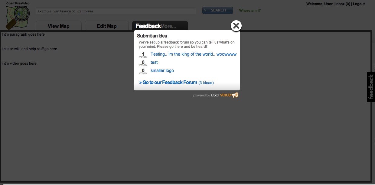
Powered by uservoice, this is an incredibly simple system to add bugs and suggestions to the site, and allow people to vote on them. Please use it to add any feedback you have on the site design (you can see the ideas and votes etc over here on uservoice too).
There are two issues to highlight with the feedback system. One, it’s not trac, our existing system. No. If we’re going to scale the project to the people we need to, the people using it Haiti or my mum, then we need to make giving feedback as simple and easy as possible. UserVoice is almost there and trac is nowhere near. Yes, you need another login with uservoice but they allow you to log in using many existing systmes (like twitter).
The second issue is that people may see a bug on the map and click feedback and try to tell people about it there. Actually, this is better than our existing feedback system for map bugs, because it doesn’t really exist on openstreetmap.org. I would love the map javascript to be able to tell the uservoice the current map extent so that people can fix the bugs this way. But right now I don’t see an easy way to do it. We could also implement our own feedback system which looked a lot like uservoice but had some map bug reporting in it too. That would be ideal but I’m not going to rely on the community as the first pass to come up with anything that user friendly, because lets face it, open source is awesome at many things but it’s not usually user interface design.
What have we lost in this design? The donate link, the into paragraph shown to logged out users and the thanks to a few key supporters. The last one I propose could be a small piece of text somewhere that rotated amongst key supporters chosen by the OSMF. The rest could reasonably be dropped or added to the “Help & More” tab.
Lastly, with a prominent tab we can, if it makes sense, replace the default view from the map to the “More & Help…” tab. Perhaps once you have an account, you can change the default to be either the map view or the help tab. This would do a number of things like cut way down the number of tiles shipped by the tile servers by default, and present a really clean and informative “get started” page to new users. Again, it doesn’t have to be the case, but it might be nice to try.
So, what do you think? Please get involved on the feedback tab mentioned and remember that this is a concept and subject to change with your input. Think about what could be added or subtracted and very importantly how we can begin to pull in much more feedback from the users of the tools and the map so we can close bugs more quickly and add the features they really want.
Note: Do I want to nuke the existing design from orbit tomorrow? Absolutely not – this requires a lot more work, feedback and implementation before we actually update the existing design.
It would be nice if there were a button that removes all the non map interface. Also having the bar at the top is not the greatest idea because people with netbooks that have really low resolution and a wide screen will not get very much map.
Is there something wrong with the current site? I like it because it is simple, humble, and is none too flashy (in both senses of the word) either. It was the same reason Google appealed to me in the first place: nothing but the point. I like how it is very minimally done.I am hardly ever one for keeping the old or thwarting innovation, but does anyone agree with me here? I would rather focus on data/content management and manipulation, not making the website prettier for better press (and yes, I know the guys at the top will have the opposite prerogative, and I cannot hate you for that)?
@klusark – yeah it would scale the width like the existing site does@Alexander – well the page hasn’t changed in 3+ years, is getting clunky, and really doesn’t expose the help and feedback nearly as much as it needs to today, it’s the number 1 complaint I hear.
@Steve Coast: If that is the case, then you are right to move forward. I do not care too much, only do not want form over function as the hype grows over OSM (in the US, Haiti is making it look really hot right now). If there are complaints from the field, then the change is needed. Thanks for such a quick response.
I can’t help thinking it would have been nice if you’d spoken to the people who have been doing all the work on the web site for the last few years before striking out on your own like this… You know, the people that have been trying for the last six months or more to organise a redesign of the site…For what it’s worth, your suggested design appears to go in all the wrong directions as far as I can see – our biggest problem is pressure for space on the home page and your design actually reduces that by giving even more space over to the map.I’m not entirely clear about your uservoice plans, but it sounds like you may be trying to use one system to handle both errors in the map data and bugs in the web site and other systems and to my mind those are two separate things which should be handled separately. Of course there’s the question of whether we want to (a) be reliant on an external service and (b) move even further away from the single sign on goal we’ve been trying to achieve.
@tomAs far as your comments on talking to people who have been "trying for six months"… there’s not been anything on the mailing lists I’ve seen, and JFDI is a virtue in this project not a curse.As for expanding the map, I think you need to read the paragraph about it needing feedback and how you could perhaps default to the Help tab instead of the map.As for uservoice – I thought I made it painfully clear that it’s not perfect by any means. As for relying on an external service, sure, but I don’t want to wait until hell freezes over to write our own implementation either. It seemed like a nice straw man to put in the design.
Seems very nice, clean- and has information on the project, which is a huge plus.I really like what I’ve read.What’s not as nice, though is needing another set of credentials. Can’t we tie the user authentication systems together using LDAP or something? If not, can we at least move the web-ish things (wiki, and this new tool) to OpenID?
The thing that used to bug me the most about the site was the place search. It was slow and rigid, but it is neither anymore which is great. Still I think there’s room for improvement – most folks who go to a map site want to find a place quickly so the search box need to have a more prominent place on the site. In that way your design proposal is good. Second, the search should be more zoomlevel-dependent. Display local results if the user is at zoom 15 and worldwide results if he’s at zoom 5, because that is what he most likely wants.
That looks really great. I hope we get this as soon as possible!@Alexander Stein: actually this concept looks much more clean and easy to use then the page right now. The OSM page does look very complicated and old because of this "look through the window"-look (would I say). And it takes a lot of space.@Tom Hughes:It is great that he came up with some new ideas even if he didn’t talk about it in the community. But from my point of few he had to. Since the first few concepts about a new page design I hadn’t seen anything about a new concept afterwards. So sooner or later somebody else had to come out with something new and I hope we will get there soon.
I think the prominent feedback will be disastrous if it isn’t prepared to get map errors, because it will. Map errors, and even some bugs, are benefited from having the current location appended to the feedback. I think the OpenStreetBugs system is good for that, and provides people to look for reported errors in their area, it’s been suggested it gets implemented into the main site.As another netbook user, the stuff at the top will minimise my screen space, but it makes the search box a better size, which is more ideal for new users. Perhaps I should switch map providers anyway, I might even make one that is full screen but gives me an osm.org permalink to hand out. (and I get to choose the available layers I want)I know discussions over site design have gone on for years in pubs. I thought a big problem was the information besides the map and linking to other places. Currently this is the wiki Main Page, and that has limited design capability but the ease of being up to date and people creating new modules. Steve, your "Help & More" tab not linking to the wiki could change things, but it needs some real good design. Who says what gets to go on there, how/who updates and changes it?Is there a wiki page that these comments should be collated, probably in a form separate from Steve’s design (eg discuss text being at the top/right/bottom/left) and then a list of links where people have made prototypes (inc this blog post). It would be a kick to get in action for those who care but still continue our whole bottom-up management of things. We could look for conclusions on each point/argument and then combine solutions into a final proposal. I say this with no idea of timescale.
Uservoice is a nice system but should we be tying ourselves to a proprietary system?
One of the questions that always seem to come up with any discussion of a re-design of the website is what is OpenStreetMap about? The Map or the Map-data. I.e. should we highlight the map as prominently or rather use the space to prominently show off all the other cool things that can be done with the data.IMHO the choice of having the map as the focus of the homepage is good and I would prefer to keep it that way, but your design seems to neglect the other side completely. I think it needs e.g. another tab "Cool uses of OSM…" that links to a nicely designed page showing the variety of OSM. After all, that is what OSM is about and what distinguishes OSM from yet another free (as in beer) mapping page, to a free as in freedom map. I would also not lump it all into into the "Help and More" tab, as after all who clicks on a help button if they don’t need help?In that respect, it would also be good to design a better layer chooser that can scale to show a much larger variety of maps than the "some what arbitrary" three we currently choose. This might also reduce the pressure on the mapnik map to cram in every possible feature, overloading the cartography, if more special purpose maps like the cycle map featured in the layer chooser. Apart from that, I am wondering why the tabs for Export and User Diary were dropped, and where History and GPX would be found in your design?@Serge Wroclawsk: I have done some work on integrating OpenID into the main page ( http://openid.dev.openstreetmap.org/ ), but it probably needs more work before it can be integrated and it doesn’t tie in with the other login systems like the wiki or the forum.
@mvexel The new search system is already map-view aware – by default it only searches the area view and a small buffer around it (it doubles the size of the view) and only if it finds nothing does it fall back to searching the whole world.
I’ve blogged some of my thoughts on the redesign issue at http://compton.nu/2010/02/redesigning-the-openstreetmap-web-site/
How about the rendering of tiles once a certain area is edited? Can the individual tiles still be accessed? Can you still add "/dirty" to the end of the address linked to the file?
@Kai Krueger As a relatively new OSM user and contributer I personally find the tabs for Export, GPS Traces and User Diaries to be too much info. I understand the roots of OSM but if we want to have something more than just "better maps" to offer we need to appeal to users who just want to *use* the maps not make them. @Steve Coast This is a great mockup and the direction I’ve wanted to see OSM go for years. The current OSM design is very map-maker focussed and practically hides the fact you can search the map.UserVoice is interesting however it won’t let me signup for a new account! There are some page rendering issues on webkit i’m guessing. And if it’s proprietary, like Corey Burger said, well that’s the nail in the coffen.IMO this is the order of importance for content on a new OSM design:1. Focus on searching2. Maximizing space for the map3. The roots of OSM. Which is "Edit" this map. (All the other stuff from the current OSM site such as GPS Traces and Diaries should come be found under Edit.)Your design comes very close to hitting all of these very well.Less is more 🙂 Good job.
I really like the large search bar. Its a pain to use the current one…
If you’re redesigning the Openstreetmap web interface you really might as well look at the OSM ‘family’ of sites (blogs.openstreetmap.org, forum.openstreetmap.org, lists.openstreetmap.org, trac.openstreetmap.org, wiki.openstreetmap.org, maybe even here). These sites typically look look like the default for their content managers, leaving oddities such as the ‘wiki’ link on the Trac site that goes to its own home page, and there is scope to integrate them, for instance the user pages on the forum do not link to the their counterparts on the main site even though the user accounts are the same and there are no user links at all on the Trac site. A good redesign should be able to make the sites more usable as well as more consistent.
I think a re_design_ of the OpenStreetMap homepage doesn’t bring great benefit to anyone. In my opinion, the design of the current homepage is clean and understandable enough to keep it. Instead, I think we should focus on improving the functionality of the homepage. Lots of services and tools have been built aroud OpenStreetMap, such as routing services, OpenStreetBugs and new tile renderings. Many of them are designed modularly, so it would not be a big deal to include them in the homepage. At the moment I just see too little influence of the community-created tools and renderings on the homepage. Why is the OpenCycleMap included everywhere, but not the ÖPNV-Karte or the hiking map? Why are Mapnik and Osmarender included, but not the MapSurfer maps?Also, I would focus on improving some functionality on the homepage. For example a search that works without JavaScript and can thus be included as a search shortcut or a search engine in the browser. Or live Permalinks so that your current map view does not get lost when you restart your browser (like I tried on http://osm.cdauth.de/map/). Or something as simple as a bar on the bottom left that shows how much a kilometre is on the current view.I don’t like the approach to include a simpler bug tracker into the homepage. I have made the experience that commercial user interfaces that try to be simple and newbie-usable tend to be unusable for developers. I don’t think that bugs on the homepage or in other applications are discovered that often that a newbie-usable interface would be necessary. I think it is sufficient when more experienced users are able to report these bugs.For map data bugs on the other hand, there already is OpenStreetBugs, which can easily be included in the homepage and could also be slightly improved to become more newbie-friendly.
I agree with adding more community sites to the front page but with one caveat. New users will naturally think that anything linked from the front page is good advice for mapping, for instance they sometimes think the ‘Not in map features’ Maplint message is a request from the community to casually remove tags. Similarly letting renderers that are capricious with what they accept onto the front page may encourage tagging for the renderer, this was an issue during the delay before the cycling map accepted highway=path and would be a problem if either of the sea maps went on today.
More search, more map area, more clarity about the differences between OSM and other map providers (you can edit and report bugs) – all excellent :-)I’m all for making the front page of openstreetmap.org about the map. People seeing the map in their area, and how good (or not) it is should be a great driver to get people involved. We don’t want to try and explain it on the front page as text.Another radical option would be to split osm.org and openstreetmap.org. Have osm.org be the map (a la maps.google.com), and openstreetmap.org be the project.Gerv
@Candid Dauth:As far as I know, everybody that has ever asked for their rendering to be on the home page is already there – we can’t just go sticking anything we like on because it probably cause an instant meltdown of their server.As for integrating external services, we don’t do that for a very good reason – we want to be in control of anything that we are presenting as a core part of the project and have it running on our servers where we can control it rather than running the risk of having random bits of the home page just stop working one day.Search shortcuts are already possible – just add ?query=XXX to the URL and it will launch a search. There is also a browser search plugin that should be available for installation from the browser’s search drop down in the normal way.The scale bar is missing for the reasons which have been covered several hundred times in trac, on IRC, on the mailing lists, etc, etc…
I would recommed to ask the guys of http://www.openusability.org for assistance and http://www.openclipart.com for artist for cooperate iconsets/help.
A thoroughly un-thought-through idea, but I thought I’d throw it out there anyway. Now we can, perhaps we should split out the project from the map, and have openstreetmap.com, the web map site for consumers, and openstreetmap.org, the site for the project, mappers and anyone who wants to use the data for themselves. If we have two different audiences, why not just have a site designed for each of them?
@Tom Hughes:You are probably right about the availability of third-party-hosted tools. But I don’t see a problem in copying some of these resources to the OSM server.I think I missed the fact that search shortcuts are possible in the meantime, thanks for pointing that out.I did not participate in any of the discussions about the scale bar, so I don’t know about that. I don’t have the time to read the mailing-list very often.
So what’s the benefit of using uservoice if:a) you need a login (wipes out most casual users)b) you can’t enter map bugs (wipes out most common use)What’s it for? For the average user to more easily report bugs in…what exactly? Mapnik?
@Steve Bennett, why don’t you go back and read the post where I make painfully clear it’s an experiment?
Does that mean you don’t know? I’m not attacking you, I was just curious what use cases you saw here. You clearly think it’s a good idea to try to collect more user feedback of some kind, but I’m asking, what kind? Not map bugs. Editor bugs? Are there many people for whom obtaining an account on the trac and entering a bug (admittedly, even finding the trac is near impossible) is too hard, but for whom obtaining an account on uservoice is easy enough?
@Steve Bennett… again, did you read my post? "We could also implement our own feedback system which looked a lot like uservoice but had some map bug reporting in it too." amongst other things I said? 🙂
Whee.What I’m saying: "What kinds of things do you think users should/will provide feedback on with uservoice?"What you’re hearing: "OMG SteveC you suck uservoice sucks!!! noone will ever use uservoice because it sucks so much and if it doesn’t do map bugs whats the point lol?!!"
I think it’s open ended, and what’s been submitted so far has been fantastic. Bugs and feature requests are equally useful.
I love the concept, but the colours seem a bit of an afterthought. The OSM logo and map widget colours clash with the rest of the site, which is probably to be expected considering they haven’t been touched in this mockup. I’m not sure if it’s in the scope of the project but I’d love to see a more professional logo come out of this project. 🙂
I like the new design.The space is much better used – actually I’ve been waiting for that to happen!@feedback-tab: realizing that feedback is so important to the project I would at least hesitate to start relying on third party services.
I really like the large search bar. Its a pain to use the current one…
The large search bar and The Map Search had changed from the previous version. The current opengeodata.org has more useful to us!